The context
The old site was not helping people understand the depth of Nomba's products.
Nomba had grown beyond a simple payments story. The business now needed a website that could explain banking, POS terminals, payment collection, online checkout, and business tools without making users work too hard to connect the dots.
The immediate trigger was reputational. A previous AI-generated website looked unfinished and did not represent the quality of the company. People called it out publicly, so the redesign had to feel intentional, credible, and easy to understand from the first visit.
The design problem
Make every product easier to learn about, while making every page sell the value better.
Poor trust
The AI-generated version made the brand feel less polished than the product.
Buried features
Important products did not have enough dedicated space to explain value.
Wide audience
The site had to work for digital-first users and older business owners who need reassurance.
01 · Business banking entry
Homepage
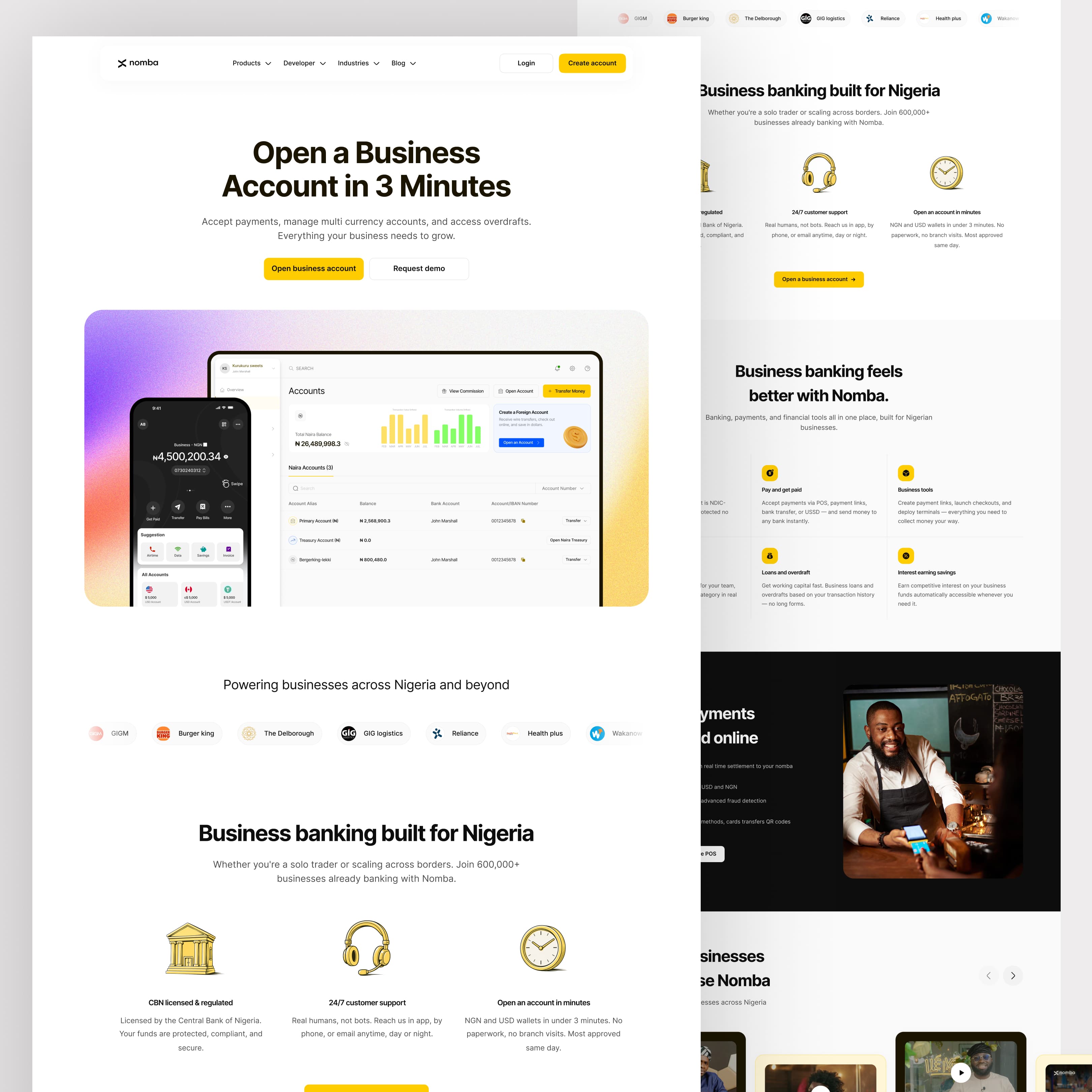
The homepage became the new front door for Nomba's business banking story. The hero leads with opening a business account in minutes, then moves into proof points around NDIC protection, payment collection, business tools, expense tracking, loans, savings, customer stories, and a strong account-opening CTA.
Open a business account in 3 minutes
Banking, payments, and tools in one place
Customer stories and trust signals
02 · Product depth
Business Accounts
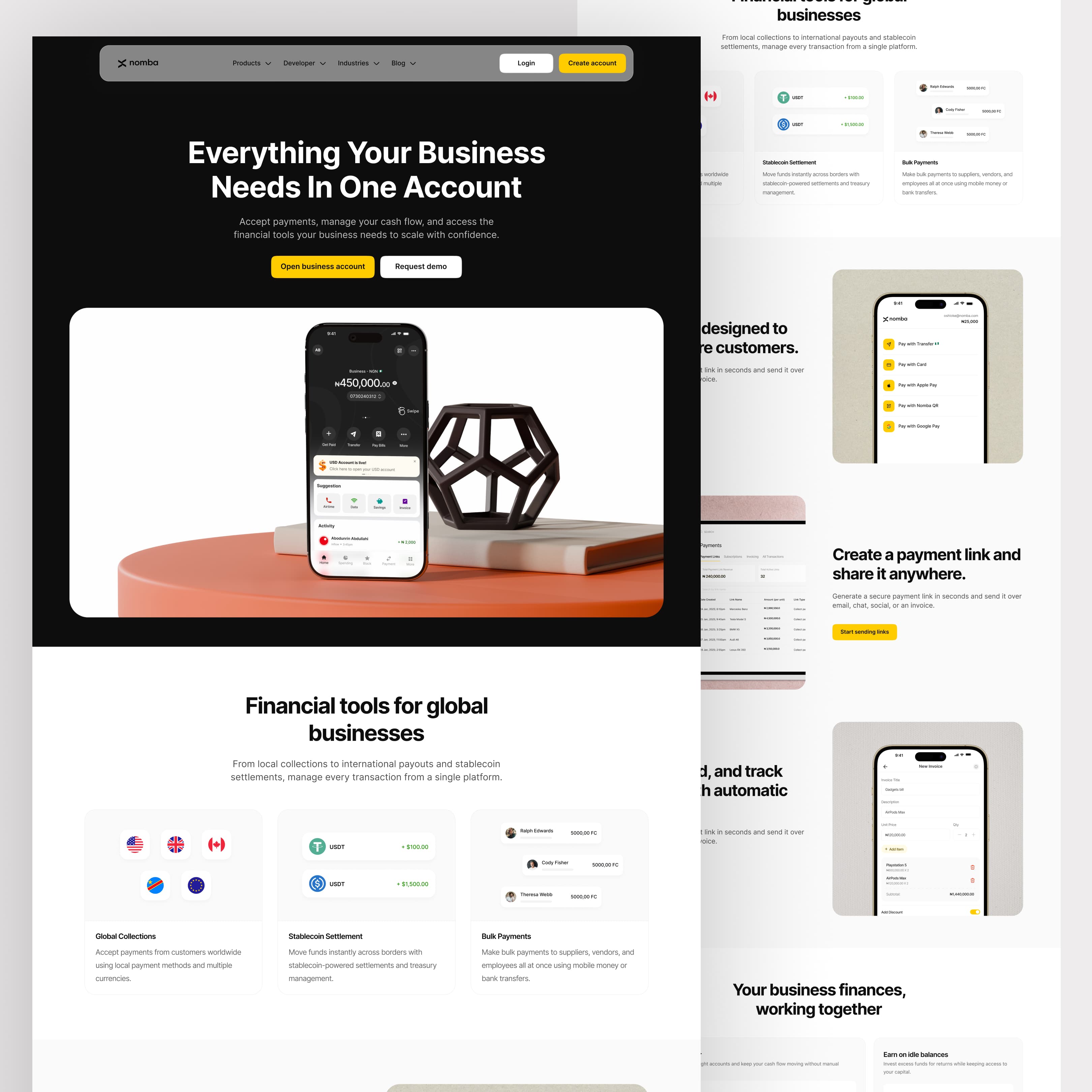
The business account page gives the core account product its own story: accept payments, manage cash flow, access financial tools, and operate locally or globally from one account. This page carries the broadest value proposition and helps older, trust-driven users understand safety and utility quickly.
Account as the product hub
Global collections and settlements
Clear business utility
03 · Global money movement
Multi-currency Account
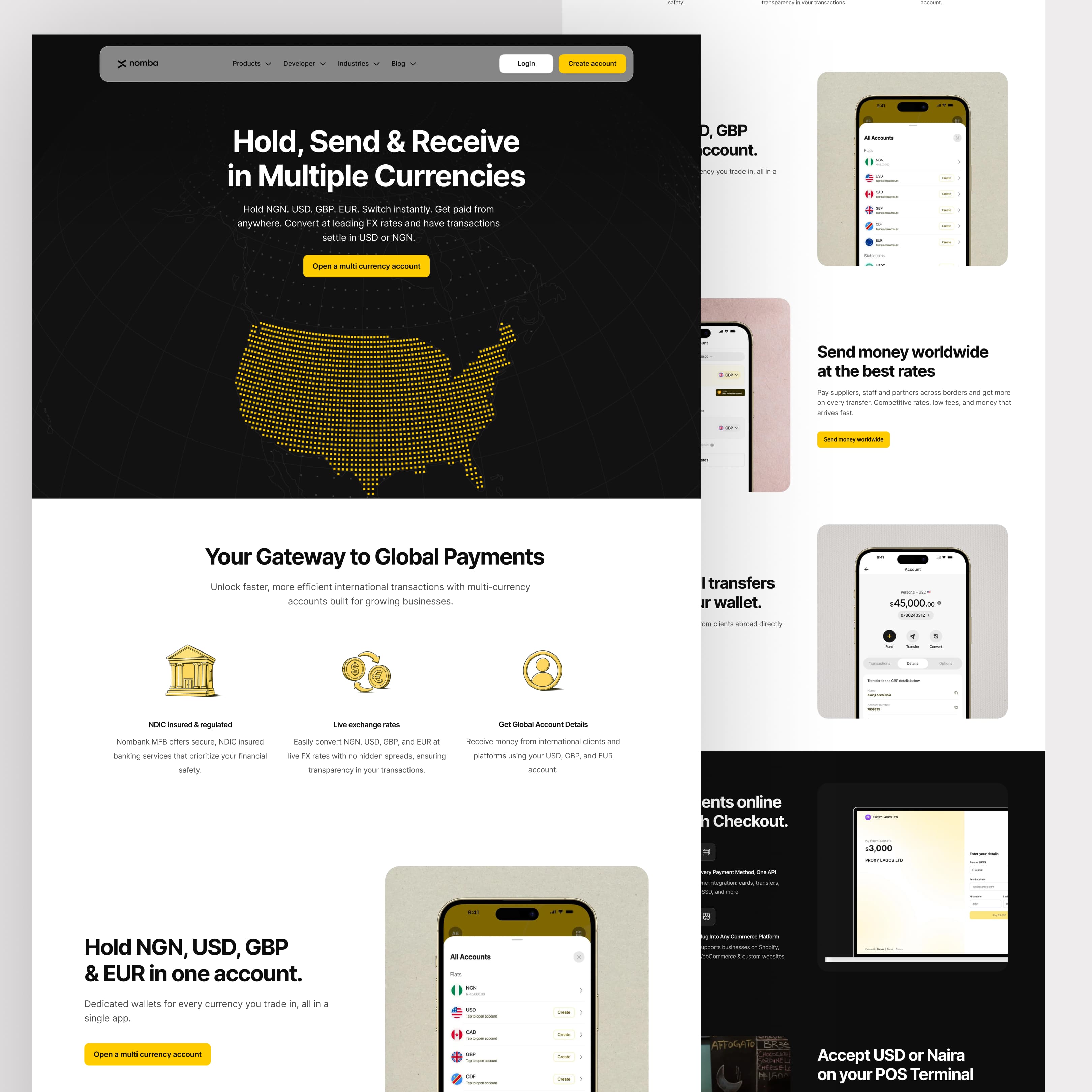
The multi-currency page focuses on holding, sending, receiving, and converting NGN, USD, GBP, and EUR. It explains international account details, live exchange rates, and regulated banking reassurance without making the page feel like a compliance document.
Hold and convert multiple currencies
Global account details
Live FX and regulated banking
04 · Online payments
Online Checkout
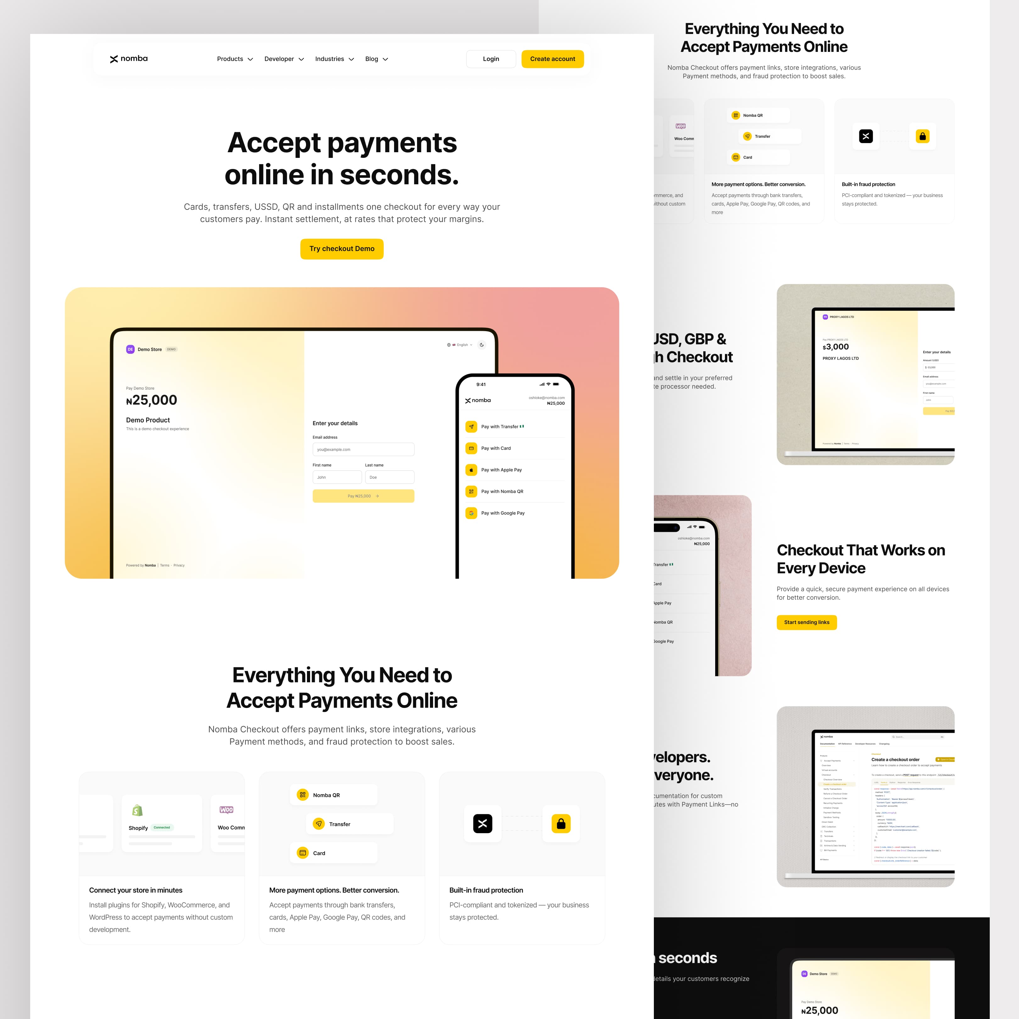
The checkout page is written around speed and choice: cards, transfers, USSD, QR, and installments in one checkout. The page also upsells practical adoption with store integrations, plugins for Shopify and WooCommerce, fraud protection, and instant settlement.
Cards, transfer, USSD, QR, and installments
Store integrations
Fraud protection and settlement
05 · Flat-fee transfers
Payout & Transfers
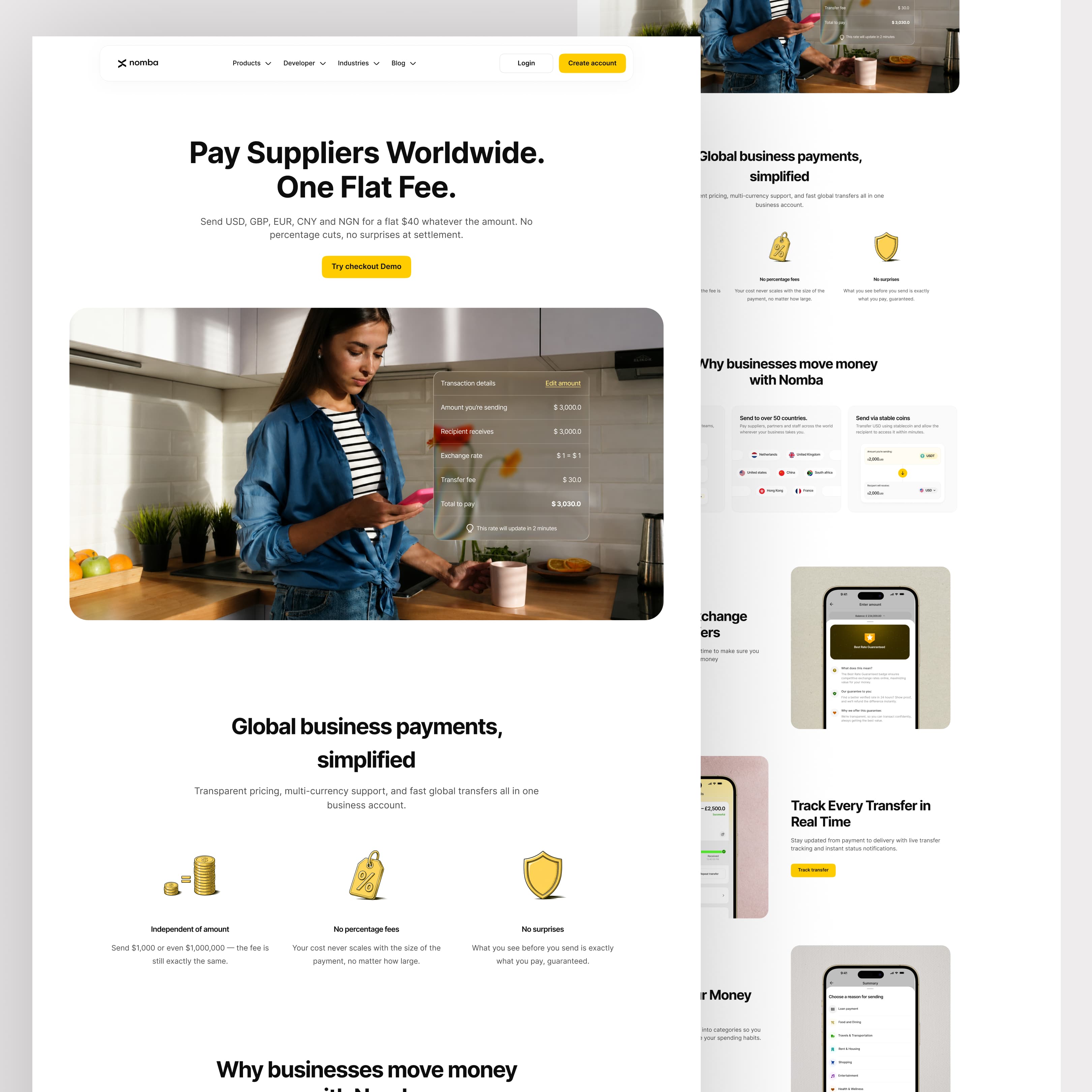
The payout and transfers page reframes international payments around transparency: flat fees, no percentage cuts, multi-currency support, and predictable settlement. It was designed to make a complex financial action feel understandable before the user ever starts a transfer.
Flat fee positioning
No percentage surprises
Multi-currency transfer flow
06 · Fast collection
Payment Links
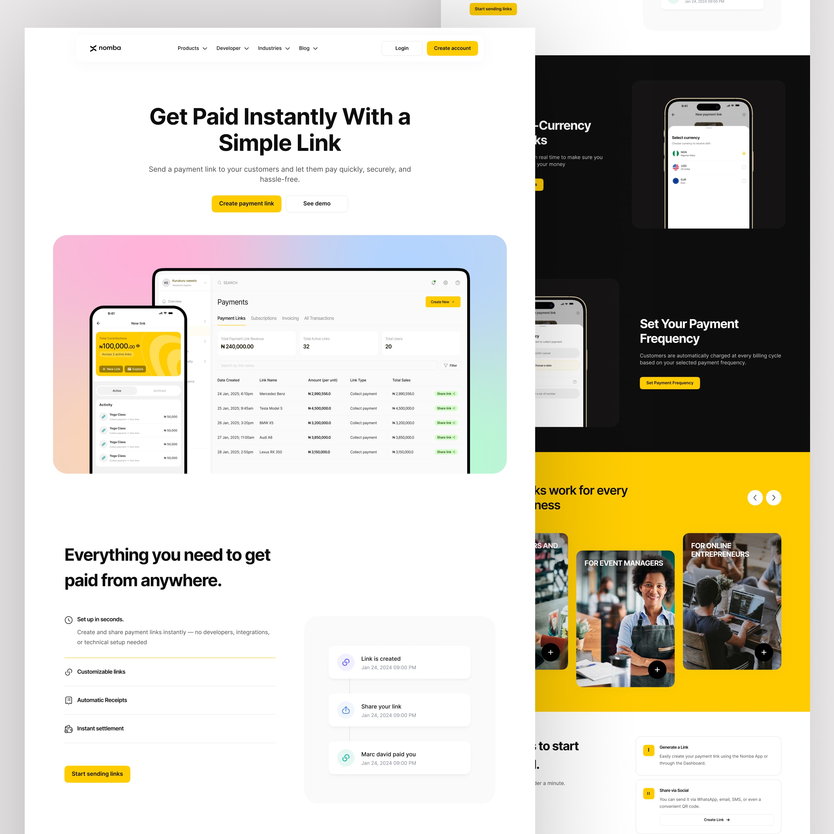
Payment Links needed to feel lightweight and immediate. The page shows how a business can create a link, share it with customers, collect one-time or recurring payments, and track active links without needing a full online store.
Create and share links
One-time and recurring collection
Simple activity tracking
07 · In-store payments
POS Terminals
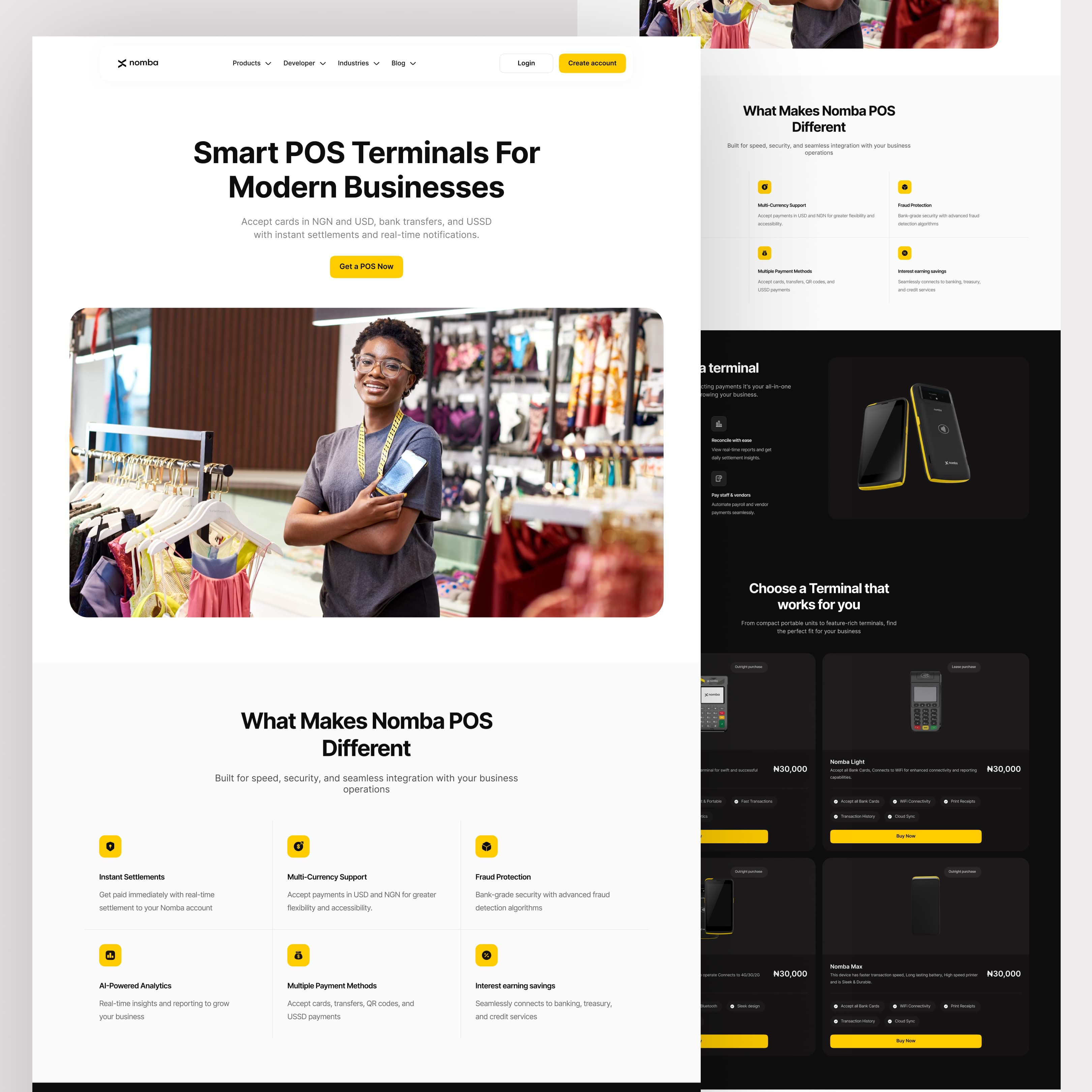
The POS page sells the physical payment experience: smart terminals for modern businesses, instant settlements, multi-currency support, fraud protection, and real-time notifications. It gives field merchants and storefront operators a dedicated path instead of hiding POS inside a generic payments page.
Smart terminal story
USD and NGN acceptance
Instant settlement and notifications
08 · Support content
Invoicing and Blog
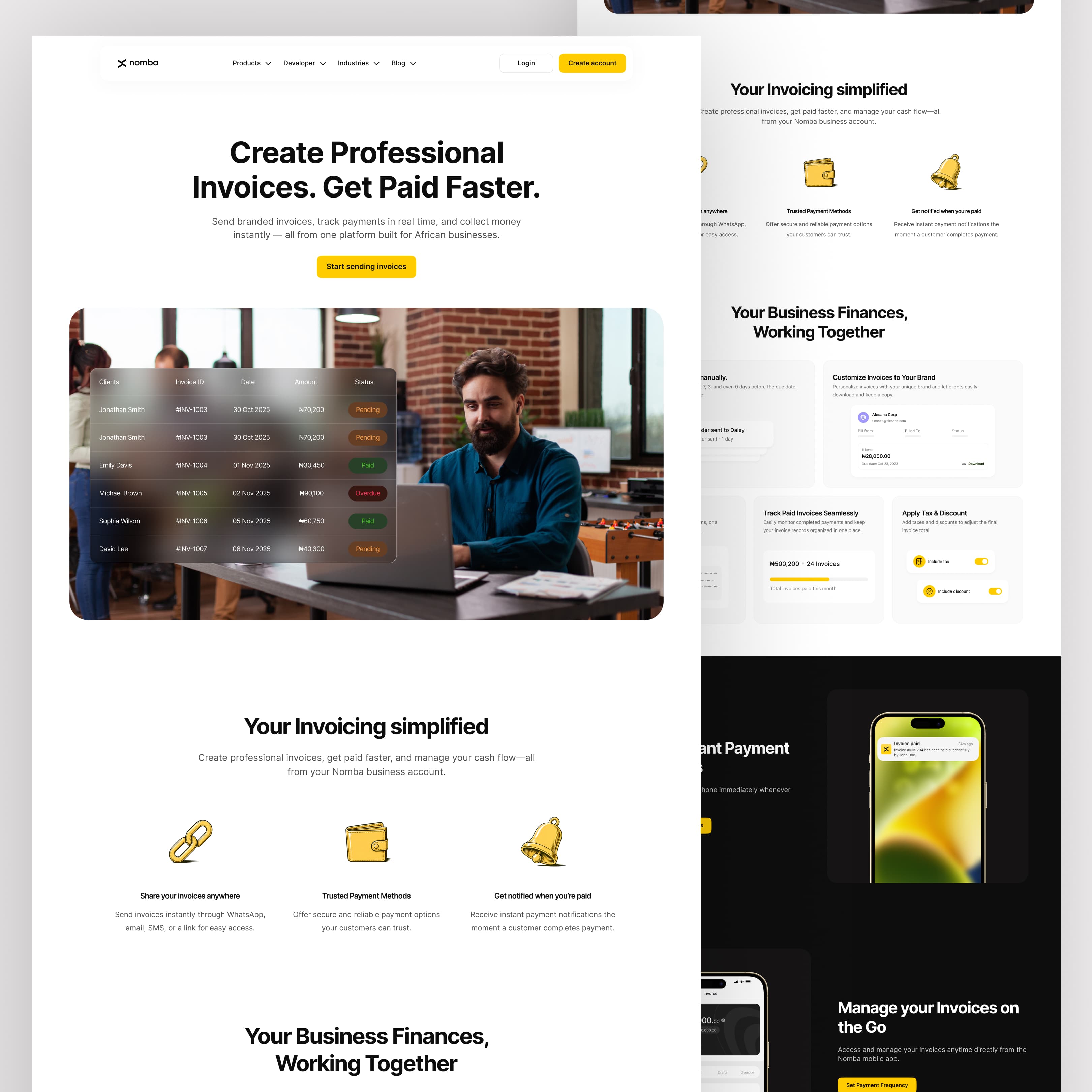
The invoicing page explains branded invoices, real-time payment tracking, and faster collection. The blog page adds an editorial layer for business tips, customer stories, events, product updates, and financial education, giving the site a way to keep teaching users beyond product pages.
Professional invoices
Payment status tracking
Education through blog content
The outcome
A website system that gives each product room to explain itself.
The redesign moves Nomba from a generic website into a product-led experience. Each page now has a clearer job: introduce the feature, explain the business benefit, answer trust questions, and guide visitors toward the next action.
Next project